hamburger menu icon
close nav menu icon

Cloud storage for all users of technology.

2d vector illustration of a woman reaching for a cloud
cloud storage app on computer screen
cloud storage app on phone screen

Stratus is a cloud storage tool for all users, no matter their technology experience level. It’s a simple and intuitive approach to cloud storage that just works.

Overview

role icon

Role

  • UX/UI Design
  • Visual Design
  • Branding
deliverables icon

Deliverables

  • User Survey Results
  • Competitive Analysis
  • User Personas
  • User Stories
  • User Flows
  • Wireframes
  • Brand Style Guide
  • High Fidelity Mockup
  • Usability Testing Results
  • Final Clickable Prototype
tools icon

Tools

  • Google Forms
  • Paper & Pen
  • Draw.io
  • Figma

Problem

The main focus of this project was designing desktop and mobile versions of a new cloud storage application coming to market. The client expressed that they would also need a name/brand, an idea of the target audience for the product, and a clear overall vision for the direction of the project.

Solution

Stratus is a cloud storage application that takes inspiration from other competing platforms, but stands out because of its appeal to the everyday user. By marketing Stratus as a tool that everyone can use, the brand is easily approachable. By making the platform’s visual style simple and clean, the brand keeps users coming back to it.

Research

User Survey

I conducted user surveys on a diverse group of participants all with different professions and ages. In order to keep the results relevant, I included some screening questions pertaining to the users’ familiarity with technology in a general sense. Overall, participants were attracted to features such as simple user interfaces and available free storage. A key takeaway I observed was that most participants organized their files using folders, and not as many used category/group tags.

How important are collaborative features to you in a cloud storage application?

How do you organize your files in your cloud storage application of choice?

100% of participants were interested in accessing cloud storage applications on their smartphone or other mobile device.

Competitive Analysis

I performed a competitive analysis on Google Drive, Dropbox, and OneDrive. It was quickly clear that each of these applications did a great job of onboarding their potential users and providing an intuitive interface for uploading and managing files. All of the products go after everyday users of computers/file storage as their target audience. Because this is such a universal need, this isn’t hard to do.

I reasoned that the main source of success for these products was seamless and intuitive integration into a users already-busy workflow. File management is something that practically all computer-users need to do, so utilizing an application that requires barely any setup and works incredibly well is really important. All of these apps do this well, and it differentiates them from the competition.

Competition Strengths

  • Clean, simple interface
  • Collaborative features for teams
  • Intuitive - Replicates “File Explorer” or “Finder”
  • Right click menu available

Competition Weaknesses

  • Right click menu not available in Dropbox
  • Moving an item to a folder takes longer than expected under certain circumstances
  • Interfaces too busy with extra info
google drive brand icon dropbox brand icon onedrive brand icon

User Personas

Based on the results of my user surveys and the major takeaways from my competitive analysis, I put together user personas to represent the three main groups of users expected to use the application.

photo of middle-aged white woman with blonde hair

Office Admin

Backup Files

scale graphic at lowest notch

Basic

"

I dont know what the cloud really is, but I’ve been told I can save my files to it and retrieve them if something goes wrong.”

Goals

  • Back up files to the cloud in case something important gets deleted
  • Send email links with large files to her co-workers
  • Retrieve files accidentally deleted from her hard drive

Frustrations

  • Intimidated by using cloud storage
  • Work laptop is outdated and slow, so it can’t handle robust and taxing programs
  • Not interested in learning a new program
photo of middle-aged asian woman with black hair

Civil Engineer

Multiplatform

scale graphic at middle notch

Pro

"

I need an application that let’s me save and organize my files on a server. I’m a student, so I want to be able to access the files anywhere.”

Goals

  • Save important files to a remote server
  • Access files from any location on any device
  • Organize files efficiently and pragmatically

Frustrations

  • Hates when files don’t save properly and work is lost
  • Wishes there were more free storage space, because she is quickly approaching her limit
  • Wishes text file/spreadsheet editing online apps were more robust
photo of middle-aged white male with brown hair

Manager

Collaborate

scale graphic at highest notch

Expert

"

I want my team to be able to work on the same file at the same time. Emails back and forth are no longer cutting it in our fast-paced industry.”

Goals

  • Share working directories with multiple team members
  • Work on documents in real-time with multiple team members
  • Make comments on files without disrupting the content of files

Frustrations

  • File sharing permissions sometimes don’t work as intended
  • Real-time collaboration often isn’t well-implemented
  • Available cloud storage space isn’t enough for his team

Information
Architecture

User Stories & Flows

User Stories

I initially came up with a list of 35 user stories by picturing the actions different types of users would want to perform. In ranking these user stories in terms of importance, I considered which types of actions would be important to different users. For example the “Multiplatform” user would probably want to access their files on their mobile device much more than the “Backup Files” user. I ranked a total of 9 of these stories as highest priority based on what I expected to see in an MVP.

Role: Task:
As a new user I would like to create a new account.
As a returning user I would like to sign in to my account.
As a new/returning user I would like to upload a file/folder.
As a new/returning user I would like to see the progress of the file/folder I am uploading.
As a new/returning user I would like to create a new file.
As a new/returning user I would like to create a new folder.
As a new/returning user I would like to add a file to a folder.
As a new/returning user I would like to share a link to uploaded files/folders via email/messaging app.
As a new/returning user I would like for the changes I make to a document/folder structure online to be automatically saved.

User Flows

In order to model my highest priority user stories in an executable form, I created a total of 5 user flows using draw.io. These flows encompassed Account Sign In/Sign Up, Basic File Management Operations, Organizing Files with Folders, Saving/Uploading Files, and Sharing Links. Following are the flows for Basic File Management Operations and Sharing Links:

basic file management operations user flow
Basic File Management Operations - User Flow
Sharing Links - User Flow

Wireframes

Sketches

With all of the above preparations completed, it was finally time to start putting pen to paper and fleshing out the layout of the application. The “My Files” and other file management screens went through some iterations until I found a layout I thought best. To be specific, I thought a lot about how I wanted to represent the file management screen the user was currently working on (“My Files”, “Recent”, or “Trash”). One of my first ideas shows a sidebar with the current screen underlined, but I ultimately decided on using more of a “tab” design.

wireframe sketch of four stratus file management screen concepts wireframe sketch of app sign up screens
wireframe sketch of pricing plans screen wireframe sketch of alternate pricing plans screen

Digital Wireframes

Using a Figma wireframing template, I was easily able to create digital wireframes based on these sketches. My overall aim was to keep things simple and clean, as simplicity is not only something that I deemed important to the UX, but also something that was important for the overall branding of the project.

digital wireframe of stratus file management screen #1
File Management Screen Concept #1
digital wireframe of stratus file management screen #2
File Management Screen Concept #2
digital wireframe of onboarding screen for entering payment info
Onboarding Screen - Entering Payment Info
digital wireframe of pricing plans screen
Pricing Plans Screen

Usability Testing

I conducted an initial round of usabilty testing on my wireframes to get an idea of whether or not my layouts and verbage made sense.

photo of young white woman with brown hair

Jess

Tasks
  1. Sign up for account
  2. Add a piece of content to account/drive
  3. “Organize” a piece of content

Results

All users (including the less-experienced ones) were able to choose the correct menu option for uploading a file. This is important, because I feel this is the bare minimum functionality for the site. Users did however seem to have issues with the “Link File” terminology. This is something I updated in the final design. Most users said they would organize their files using folders. Nobody mentioned “tags” or “favorites”, so this validated not including this feature in my design and aligned with my survey results.

Visual Design

Branding

Instead of attempting to market this product toward a certain specific industry or demographic, I decided that it would be best to brand it as something any computer/internet user could (and should) utilize. Instead of highlighting that this was a large platform millions of people use, I thought the overall message should appeal to individual users who were looking for a “tool” to help them in their daily lives.

I decided the name of the product would be Stratus. (Cirrus looked too much like the word circus for my liking!) A stratus cloud is a type of cloud that stays low in the atmosphere. Similarly, I wanted the product to be something that was “always close by” for the user. I wanted the brand to evoke feelings of calmness, stability, and harmony.

branding sketch of different logo concepts
branding sketch of word-web excercise
branding sketch of brand language, color options, etc.
branding sketch of additional logo concepts

Moodboard

I created a moodboard to help understand how I wanted my assets/screens to be styled, and decided that the brand imagery should incorporate simple shapes and geometric designs. As you can see, I even went so far as using Windows 95 as inspiration... This explains the “sharpness” of windows in my final design. (Though this was a design risk to be sure, I think it certainly sets the design apart.)

moodboard
digital sketch showing iterations to final logo design

Logo Design

I played with a number of ideas for the logo, but ultimately settled on a design that I feel is a bit different from other cloud storage logos while still being recognizable as an image related to a cloud. Of note is the fact that the “cloud” in the logo is flipped upside-down compared to other types of designs. The arrows pointing up and down are meant to represent the ability to deposit and retrieve files from the cloud service.

circles showing four brand colors - #008080, #07468C, 8C0E6B, and #C0C0C0

Color

The primary logo and branding colors I chose were Teal and Venice Blue as they evoke feelings of security, but also lightness. I also included a violet color for highlighting other minor aspects of the UI.

brand tyrpography guidelines - typefaces, font-sizes, font weights, etc.

Typography

The logo typeface I chose was Arial Rounded MT Bold because I believe it pairs well with the logo, and is light while still being bolded and strong. The complimentary main typography I chose for the app is Rubik.

HighFi Mockups

With branding assets squared away, it was time to turn my wireframes into high fidelity mockups. Because I created my wireframes using a Figma template, playing around with different ideas was as easy as replacing blank boxes with content. Throughout this process, I contemplated a number of design variances.

The mobile design borrowed a lot from the desktop version originally and didn’t conform to the Material Design Guidelines. Therefore, the header and text entry fields were updated in the final design.

In the desktop version of the application, I changed the color and shape of the “highlight boxes” for the file management screen tabs. The original boxes were too similar to buttons used in other locations in the application and were confusing from a usability standpoint.

highfi mockup showing file management screen on desktop before changes arrow pointing down highfi mockup showing file management screen on desktop after changes
Before
After
highfi mockup showing file management screen on mobile before changes arrow pointing right highfi mockup showing file management screen on mobile after changes
Before
After
highfi mockup showing payment info screen on mobile before changes arrow pointing right highfi mockup showing payment info screen on mobile after changes
Before
After

Testing

Preference Testing

The first preference test I conducted dealt with different “plan card” designs. Users liked the design with “fuller” colors. Another test compared the original mobile application with the version that conformed more to the Material Design guidelines. Users thought the Material Design Guidelines version looked more professional/updated. Fortunately, these preference tests determined that many of the visual styling choices I made were indeed preferred by most.

highfi mockup screen showing pricing plans screen with gray backgrounds on the project cards highfi mockup screen showing pricing plans screen with more colorful backgrounds on the project cards
75% preferred this option
highfi mockup screen showing pricing plans screen with input fields having dark borders highfi mockup screen showing pricing plans screen with input fields having no borders and other stylistic changes
100% preferred this option

Usability Testing

I conducted a final round of usabilty testing on my highfi mockups. This time around, I had users complete the same tasks, but also observed things like what the user's eye was drawn to first and whether or not visual stylings were complimentary to the user's understanding of the app.

photo of young latin woman with brown hair

Megan

Tasks
  1. Sign up for account
  2. Add a piece of content to account/drive
  3. “Organize” a piece of content

Results

This second round of usability testing opened my eyes to a couple of important modifications in my design. Here are the major changes I made to the design based off of usability testing:

  1. There was a lot of confusion related to the “Get Link” menu option among users. I changed this text to “Share Link” to make the functionality of the option more clear.
  2. To help ensure users that “drag & drop” functionality was available, I added a call to action on the file management screens of the desktop version of the app.
  3. I added a blurb on the homepage that more specifically stated what the purpose of the app/platform was in order to make things crystal clear for those unfamiliar with the technology.
  4. The file path text on the mobile app was both confusing and too “bulky” on the screen for most participants. I moved the file path text on the mobile app lower in the hierarchy of the screen as shown.
highfi mockup showing file management screen on desktop before changes arrow pointing down highfi mockup showing file management screen on desktop after changes
Before
After
highfi mockup showing home screen on desktop before changes arrow pointing down highfi mockup showing home screen on desktop after changes
Before
After
highfi mockup showing file management screen on mobile before changes arrow pointing right highfi mockup showing file management screen on mobile after changes
Before
After

Conclusion

What I Learned

Sticking to my design process served me well in the implementation of this application. The project was an excellent experience in terms of honing my UX/UI design, visual design, and branding skills. Mistakes (such as initially not following the Material Design Guidelines for Android closely enough) were made, but I am proud of my final design! I successfully took criticisms from my mentor and (most importantly) users and translated them into actionable changes in the application. Following are some of my major takeaways.


Patience in visual design/branding process

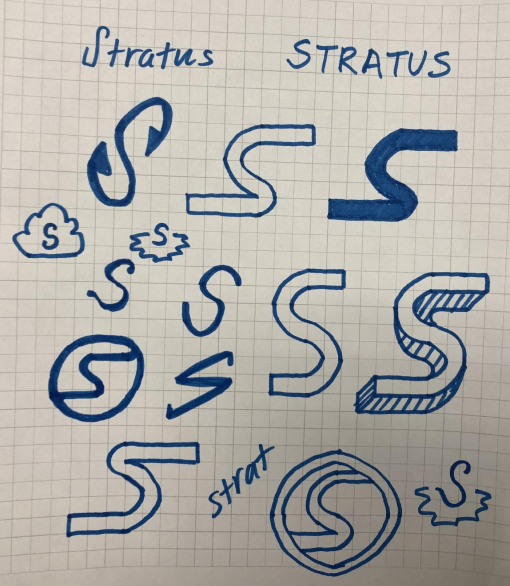
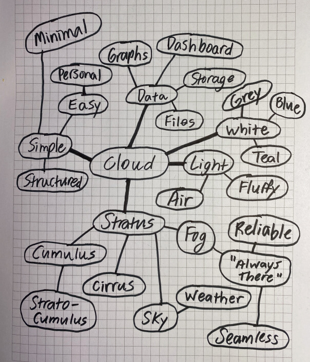
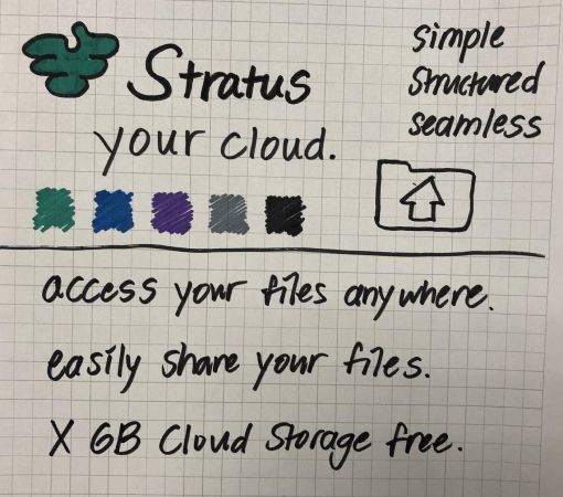
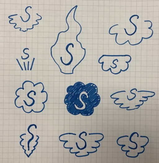
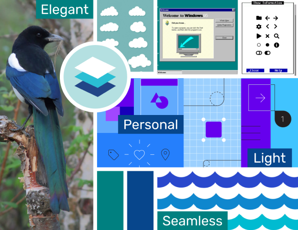
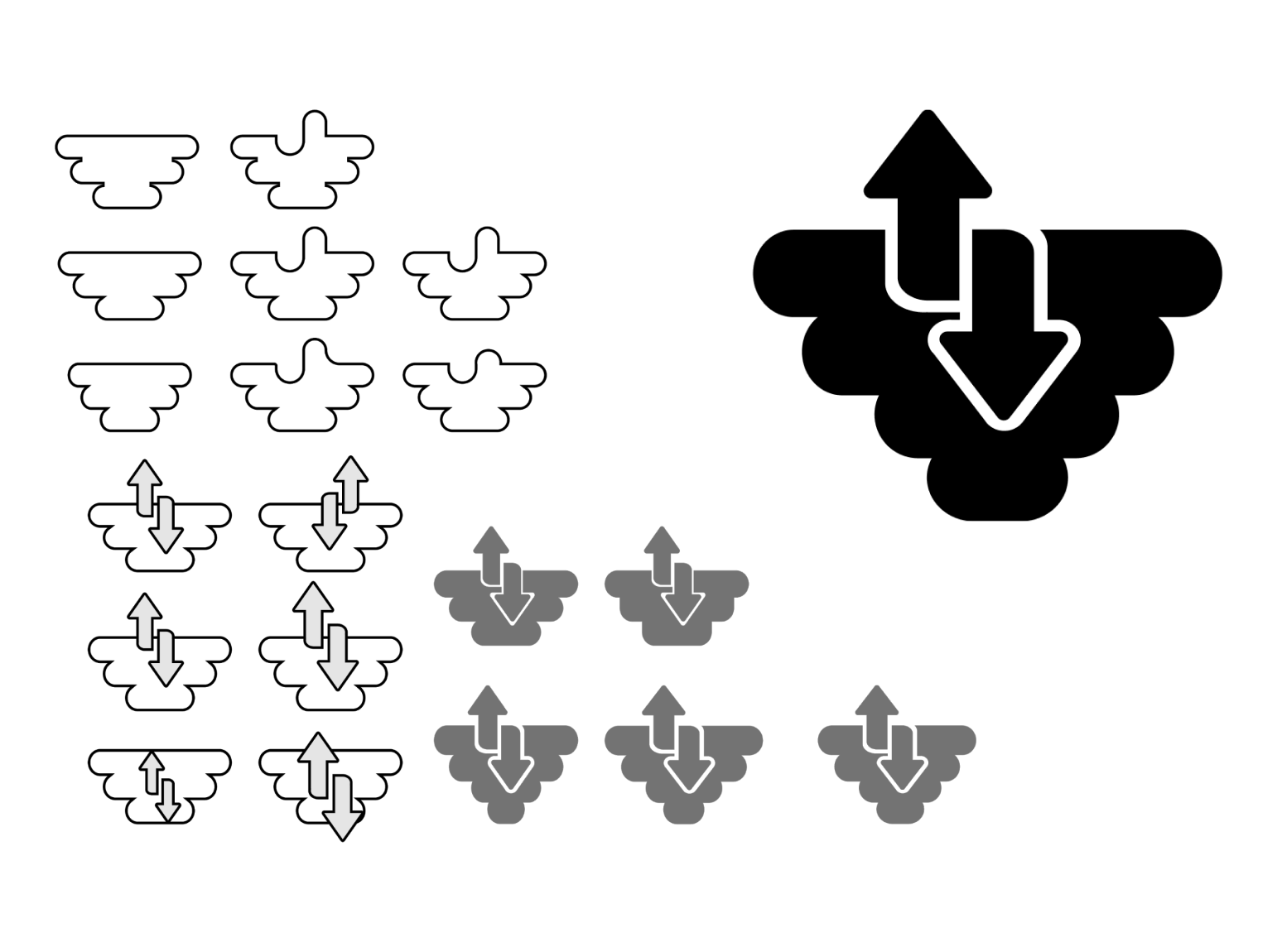
“You can’t rush art!” - Old Guy in Toy Story 2. While this quote is true in many ways, we also live in a world of deadlines where things must get done. But the importance of being patient in creating a brand still stands. Items such as my logo for this project went through several iterations, and if I had just gone with the first idea I had, I don’t think the final product would have been as strong. It’s important to allow yourself to explore solutions from multiple angles as a designer.


Translating criticisms to actionable changes

It’s one thing to accept a criticism and move on, and another thing entirely to document it and incorporate it into the next iteration of a design. This project helped me become an expert in the latter.


Importance of the design process

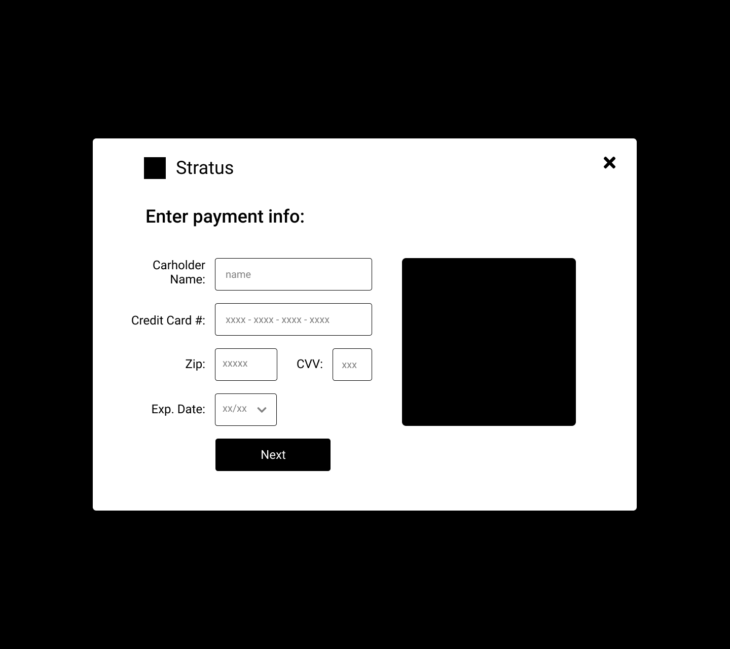
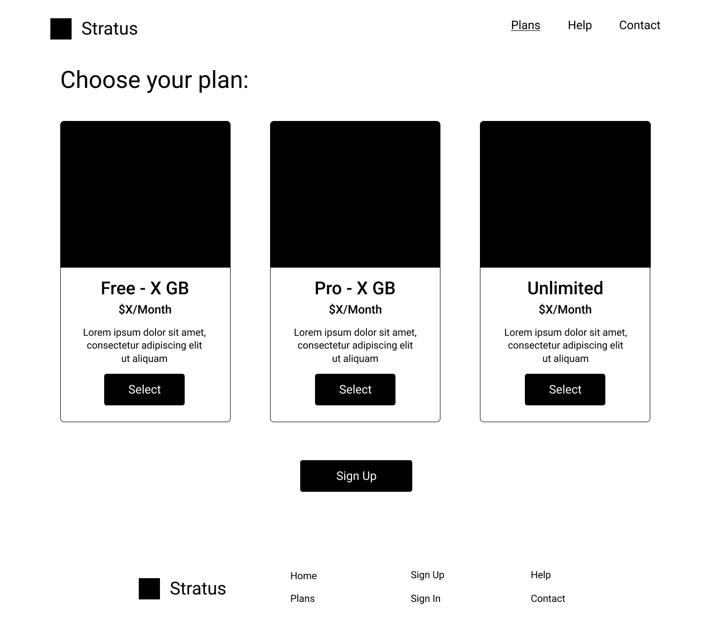
The design process that I documented above was instrumental in bringing this whole project together. One step builds on another, and in most cases if you skip a step you’re going to have difficulty somewhere down the line. No matter the size/scale of the project, I know that mindfully following my design process will always serve me well in terms of deliverables and quality of work.

Thank you for reading!

Back to top

Take me to your leader!