hamburger menu icon
close nav menu icon

Secure chat for healthcare professionals.

onboarding screen of chartchat app on iphone 11
patients list screen of chartchat app on iphone 11
patient hub screen of chartchat app on iphone 11

ChartChat is a HIPAA compliant communication platform for medical professionals. It allows them to seamlessly exchange information with their teams, outside offices, and directly to their patients.

Overview

role icon

Role

  • UX/UI Design
  • Visual Design
  • Branding
deliverables icon

Deliverables

  • User Survey Results
  • Competitive Analysis
  • User Personas
  • User Stories
  • User Flows
  • Wireframes
  • Brand Style Guide
  • High Fidelity Mockup
  • Usability Testing Results
  • Final Clickable Prototype
tools icon

Tools

  • Google Forms
  • Paper & Pen
  • Figma
  • Maze

Problem

After seeing some of the inefficiencies of the American healthcare system firsthand (along with living through the COVID-19 quarantine), the goal of this project was to design a cleaner communications platform for medical professionals. This ultimately consisted of a smartphone application that needed to be packed with features for linking previously separated avenues of communication.

Solution

ChartChat is an application that aims to make medical communications more efficient. It features “patient hubs” which allow for communication on a patient-by-patient basis and keep teams organized. More than just a chat application, ChartChat allows for phone and video calls to be made from office phone numbers, is HIPAA compliant from the core, and has many other convenient features.

Research

User Survey

To confirm interest in my app concept, I began by conducting some user surveys. I surveyed medical students, medical professionals, and patients all with varying age ranges and demographics.

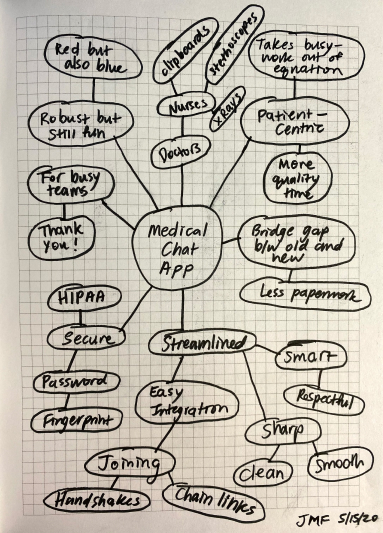
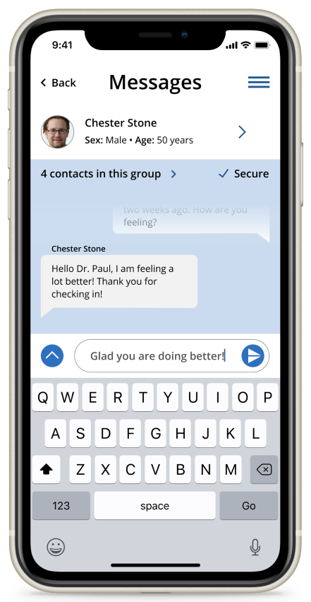
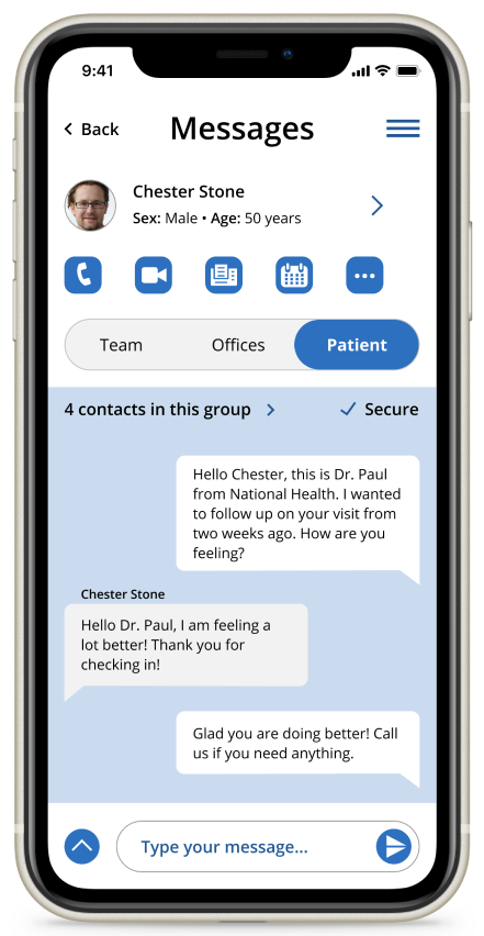
In terms of current frustrations with tech in healthcare, there were many! Healthcare professionals expressed annoyance with not wanting to share their personal phone number (but still wanting to be in direct contact with patients), poor EMR integration with current team chat applications, difficulties coordinating with other medical offices, and HIPAA compliance/security issues to name a few. Patients were frustrated with slow response times and wait times from their doctors, having difficulty transferring their medical information from one doctor to another, and not getting enough time with physicians to actually ask questions. It was clear to me that a lot of these issues could be easily eliminated through better workflow practices made possible via an application.

Key Takeaways

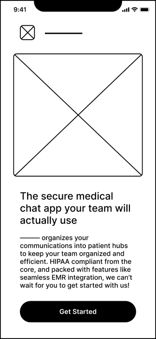
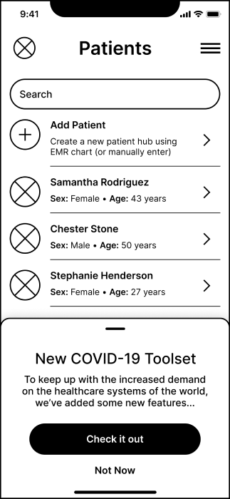
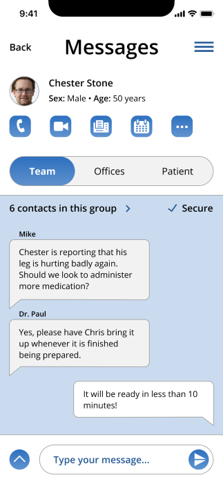
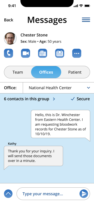
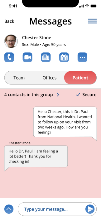
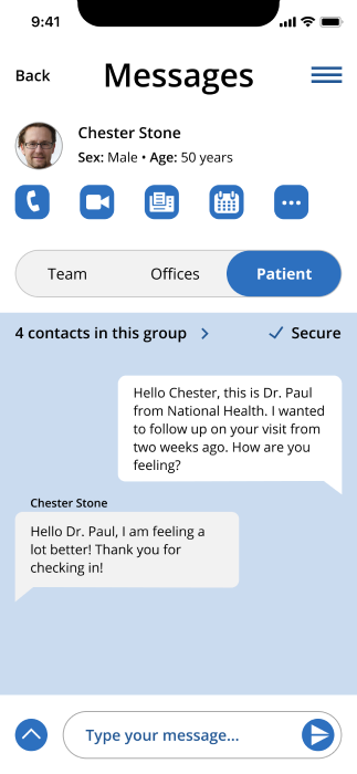
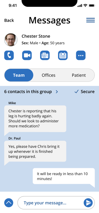
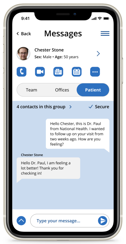
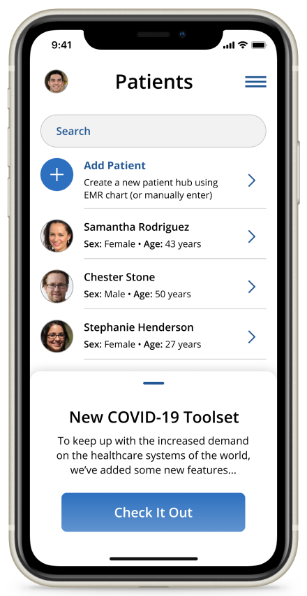
  • There is a market for an application that consolidates medical communications more efficiently and effectively than the current norm
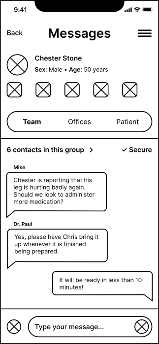
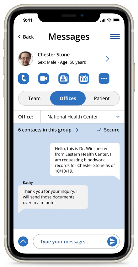
  • EMR Integration and communication across medical offices is very important
  • Secure HIPAA compliance and not requiring patients to download any app is key
  • Phone and video calling are required for fully remote medical communication with patients

How often do you use your current HIPAA compliant chat application?

How easily can you communicate across EMRs using your current chat application?

Do you currently use any sort of application for direct communication with your medical professional(s)? (Patients)

If you were to receive an unfortunate medical update, how would you want it to be communicated to you? (Patients)

100% of patients were comfortable using messaging to communicate routine concerns with their healthcare professionals.

Competitive Analysis

For this competitive analysis, I chose to examine four of the largest and most heavily advertised medical chat applications on the market. These applications were: OhMD, MedChat, Siilo, and Klara. I also took a look at the secure chat app portion of the Epic software suite (used at the hospital of one my close friends), and Doximity, a “social network” for medical professionals.

Each of these applications does a great job of providing a simple, but secure platform for communicating medical information. Following are the main takeaways from the analysis.

Competition Strengths

  • HIPAA Compliant security features
  • EMR Integration
  • Patient’s don’t need to download the app
  • Inclusion of directory of other healthcare offices/practices in Doximity

Competition Weaknesses

  • Lackluster UI design choices in Siilo
  • Inability to message patients in Siilo
  • Inability to message medical teams in Klara
  • Epic chat is outdated in look and in features
ohmd brand icon medchat brand icon siilo brand icon klara brand icon epic brand icon doximity brand icon

User Personas

In order to make the future users of my application feel more real, I created three user personas based on the research I had gathered up to this point. It made the most sense that the app would be used primarily by medical professionals, and that patients would not need to download any app. However, because the patients would still be indirectly interacting with the app, I decided to represent them in these personas as well.

photo of older woman with light brown hair

Secretary

Standard Patient

scale graphic at lowest notch

Basic

"

I’m tired of being on hold on the phone with my doctors. I wish there was an easier and more efficient way to communicate with them!”

Goals

  • Communicate with her doctor(s) easily without “playing phone tag”
  • Use technology she is already familiar with like her laptop or smartphone
  • Wants medical stuff to be a “no-brainer”. There is already enough stress in her life!

Frustrations

  • Tired of not getting quality time with her doctors because they’re too busy with logistics
  • Scheduling appointments with her doctors is inconsistent and disorganized
  • Doesn’t want to download a new app to communicate with her doctor(s)
photo of latin man with black hair

Student Nurse

Basic Professional

scale graphic at lowest notch

Basic

"

I want to be there for my patients, but my rotation is so busy, I don’t really have time to spend learning new workflows on my phone.” 

Goals

  • Communicate patient needs with colleagues in a manner that will yield the quickest responses
  • Retrieve contact info for outside medical offices in a simple and reliable way
  • Needs a unified hub for individual patient communications

Frustrations

  • Has limited time/patience to learn new technology
  • Spends a lot of time tracking down outside medical office contact info
  • Doesn’t have a simple and consistent way to communicate with colleagues about individual patient needs
photo of younger white woman with brown hair

Physician

Advanced Professional

scale graphic at highest notch

Pro

"

I like to take advantage of all the technological tools I’m given. Saving time with logistical things lets me have more quality time with my patients.”

Goals

  • Communicate patient needs with colleagues in a simple and consistent way
  • Integrate medical conversations into the office’s EMR easily
  • Spend less time organizing documents, and more time communicating with patients

Frustrations

  • Wants to contact patients individually on the go, but doesn’t want to use her personal number
  • Understands the inner workings of smartphone technology, and fears breaches in security/HIPAA
  • Is tired of working with paper documents, and wants to bring everything to the digital realm

Information
Architecture

User Stories & Flows

User Stories

With the personas I had just created in mind, I came up with 28 total users stories for the application. Because there was a clear need for many features, I made sure to comb through and really rule out the ones that wouldn’t be absolutely necessary for an MVP. For example, I ranked saving chat history to a user’s EMR higher than the ability to invite other colleagues to use the application. In the end, all of the 8 highest priority task functionalities went into the app and a majority of the “medium” priority tasks made it as well.

Role: Task:
As a new user I would like to create a new account.
As a returning user I would like to sign in to my account.
As a new/returning user I would like to communicate patient needs to my colleagues using a secure messaging interface.
As a new/returning user I would like a unified hub for individual patient charts, schedules, team chat history, etc.
As a new/returning user I would like to seamlessly save patient chat history to my EMR.
As a new/returning user I would like to access the application both on my office computer/laptop and my smartphone.
As a new/returning user I would like to communicate with my patients on my personal phone WITHOUT using my personal phone number.
As a new/returning user I would like to communicate with my patients on my personal phone and have it show my office phone number.

User Flows

Based on my highest priority user stories, I modeled a total of 5 users flows: Call a Patient, Attach an EMR Document in Chat, Export Chat History to EMR, Get Patient Info, and Send Chat Message to Colleague. I chose to model these flows because they seemed the most integral to the app’s basic functionality and I thought they would help me flesh out the app structure/sitemap most efficiently. Following are the flows for Exporting Chat History to the EMR and Sending Chat Messages to Colleagues:

export chat history to emr user flow
Export Chat History to EMR - User Flow
send chat message to colleague user flow
Send Chat Message to Colleague - User Flow

Wireframes

Sketches

With all of this research and planning completed, it was finally time to move on to wireframing my application. I began by crafting a sitemap and sketching each of my screens, which made it easy to iterate on different ideas and layouts.

wireframe sketch of the sitemap wireframe sketch of onboarding screens
wireframe sketch of app navigation screens wireframe sketch of patient hub and more

Digital Wireframes

Using a Figma wireframing template, I was easily able to create digital wireframes based on these sketches. In crafting the onboarding screens, I made sure to look at how the competition handled signing up, and tried to keep things as simple as possible. The real core of the app was laying out the patient hub screen. There was a lot of information to be packed in here including the patient info header, quick communications icons, and most importantly the segmented control bar that separated the team, office, and patient chats. Fortunately, because there are already many well-established layout conventions in designing for iOS, a heavy amount of design iteration was not needed here.

digital wireframe of welcome onboarding screen
Welcome Onboarding Screen
digital wireframe of password creation onboarding screen
Password Creation Screen
digital wireframe of patient list screen
Patient List Screen
digital wireframe of patient hub screen
Patient Hub Screen
digital wireframe of detailed patient info screen
Detailed Patient Info Screen
digital wireframe of settings screen
Settings Screen

Visual Design

Branding

The overall feel I went for with this brand was convenience and minimalism paired with respect for an industry that is made up of literal superheros (especially during these challenging times). After brainstorming a number of ideas for the brandname, I decided I liked either "ChartHub" or "ChartChat".

The brand name sounds a bit like “chitchat”, which is fitting because the app is casual in it’s approach to helping healthcare professionals easily reach out to and care for their patients. However, with features such as HIPAA compliance and EMR Integration, there is still a serious tone. This helps bridge an important gap in the medical field.

branding sketch of word-web excercise
branding sketch of charthub logo ideas
branding sketch of chartchat logo ideas
branding sketch of additional logo ideas
digital sketch showing iterations to final logo design

Logo Design

After playing with a number of different brand logo ideas, I decided on a symbol of a chart with a chat bubble inside of it. It very clearly outlines what the application does and describes the brand name. It is important to note that the mark may appear with or without the brand name next to it. But if the brand name does appear, it must be in montserrat font and proportioned correctly.

circles showing nine brand colors

Color

Dulled blues, whites, and greys are used as the primary brand colors because they instills feelings of calm. The pink and red colors are included to represent the medical field, and are used to highlight important elements of the UI. The American Healthcare system is also well represented with the red, white, and blue pairing.

brand typography guidelines - typefaces, font-sizes, font weights, etc.

Typography

Montserrat is used as the brand typography to evoke a modern/trendy feel, but is used nowhere else. Open sans was chosen as the main application typeface for it's simplicity and easy readability.

HighFi Mockups

With the wireframes and branding work finished, I began creating my mockups. This was as easy as injecting the wireframes with the brand colors and typography. I also made up some graphic designs using templates from UnDraw, and created my own icon set. There were a number of important design decisions that took place during this process. Meeting with my mentor and getting feedback from potential users helped me decide on what was best from a usability standpoint.

One of the first decisions was related to the background colors I used on the different chat sections. At first, I thought it would be best to change the color in each section to make it very obvious that the user was typing or reading messages in a different section. From a UX standpoint, I think this may have been useful, but after discussing it with my mentor and colleagues, it seemed like it wasn’t really adding much. Using the primary blue color (2D70BF) ended up being much cleaner.

My mentor also commented on the usage of gradients in all of my app icons and buttons. We agreed that using the gradient so heavily made the design look dated. In the final prototype only the action buttons have a gradient, as it helps differentiate them.

highfi mockup showing team section of patient hub screen before changes highfi mockup showing offices section of patient hub screen before changes highfi mockup showing patient section of patient hub screen before changes arrow pointing down highfi mockup showing team section of patient hub screen after changes highfi mockup showing offices section of patient hub screen after changes highfi mockup showing patient section of patient hub screen after changes
Before
After

Testing

Usability Testing

Conducting usability tests was very lucrative, and helped me make some important design updates and changes. I conducted remote usability tests with individuals, and also created an online testing platform through Maze. I aksed users to complete a total of 7 tasks, all of which represented the core functionalities of the application. Below is a clip from one of my directly facilitated remote tests with my friend who is a 4th year medical student.

photo of young middle-eastern man with brown hair

Marc

Task
  1. View more detailed patient information about “Chester Stone”

Results

Analyzing the results of my usability testing opened my eyes to a number of important design modifications. Here are the major changes I made:

  1. In reference to the video above, many testers had difficulty locating the more detailed patient information screen from the patient hub. In order to make it more clear that the patient information banner was a link to this, I added a right chevron icon.
  2. A number of Maze testers were quick to try to send a message to a patient without first navigating to the correct chat section. In order to make it more obvious that chat sections were available, I added an onboarding screen that appears upon navigating to a patient hub screen for the first time.
highfi mockup showing patient hub screen before changes arrow pointing right highfi mockup showing patient hub screen after changes
Before
After
highfi mockup showing onboarding screen that highlights three different chat sections

Conclusion

What I Learned

This project is a great showcase of all the skills I have learned throughout the Bloc design program. It reflects refined and mature visual design skills, and I’m proud of what I have accomplished! Moving through my design process mindfully here kept things organized and logical, and helped me learn so much! Here are some of the major takeaways I got from this project.


Relevant user research is extremely important

For this project, I was able to get my close friend who is a 4th year medical student to send out my user survey to a large number of his colleagues. This provided for concise and relevant results that really helped me flesh out the details of this app. Without feedback from this community, I don’t think the specifics of the application would have turned out so good. For example, I was shocked to hear about how many medical offices still use faxing… This prompted the inclusion of the pseudo-fax feature.


Pay close attention to your competitive analysis

I learned a lot about the importance of competitive analysis in this project. Not only do I believe that ChartChat is a product that could enter into the market on it’s own, I believe that the product is something that is very much needed in modern healthcare. Doing extensive user research and evaluating what the competition had to offer really helped me come to a good conclusion on what could set this application apart.


Don’t sacrifice clean UI design for UX that doesn’t contribute much

I have a tendency to want to make things extremely obvious for users. I don’t think this is a bad quality, but sometimes when UI elements are made too obvious, they actually become more confusing because they detract from visual hierarchy. This was the case for changing colors for each chat section in this app. The final design is much cleaner, and I think it gets the job done well.


Professional graphic design pairings truly make an app come to life

Being able to utilize assets from the UnDraw library and make them my own really tied this app together. It is incredible how consistent and clean graphic design can tie together a product. I think it helps users identify with the app more and set a tone of relatability.

Thank you for reading!

Back to top

Take me to your leader!